In part 1 of this little “Behind the scenes” blog, I wrote about the demands of realising our Urtext editions in an app that made the most of the medium. I also discussed what this meant as far as the layout of the musical text was concerned and how we needed to be as flexible as possible. In today’s post we’ll be looking at a few of the additional functions and the presentation of the non-music texts in our editions.
Repeats – the bane of page-turners
We’ve all been there: At a chamber music concert a page turner is sitting next to the pianist who is playing a piece of classical music with numerous repeats, presenting the former with a special “challenge” (one could also say, perhaps making them break out into a cold-sweat!). In some cases they have to turn back five pages, in others three and sometimes a repeat is omitted (Hallo? Urtext?). Hopefully the pianist and page-turner have talked about this in advance, otherwise things might go horribly wrong.
For the digital version of our Urtext editions we have, of course, thought very carefully about this issue. About whether it is possible to make this situation less fraught and safer in the app. Well, first of all, you can change page by tapping or swiping the page, or pressing the page-turn pedal. If you are familiar with how to use the pedal, you are more independent and can dispense with the page-turner. And in cases of repeats, we came up with something special. If you tap on the screen using two fingers, or double tap the pedal, the musical text jumps back to the beginning of the repeat, no matter how many pages this involves.
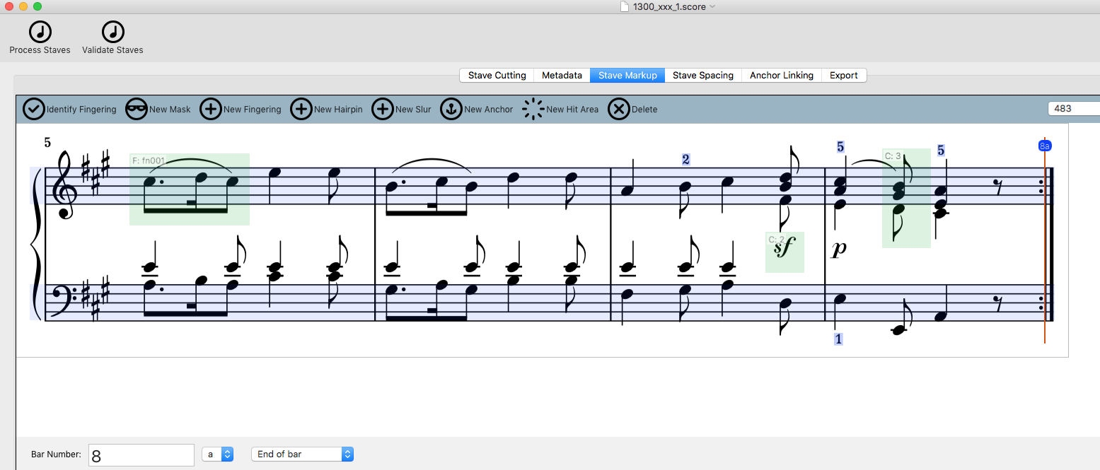
To be able to do this, the music data had to be edited to include additional information. Here’s a screenshot of the tool “ScoreProducer” that was developed by our partner Touchpress.
Using an anchor – that’s the red line that you can see at the repeat sign – we mark the place where a two-finger tap generates a repeat. And we place an anchor at the beginning of the repeat, too.
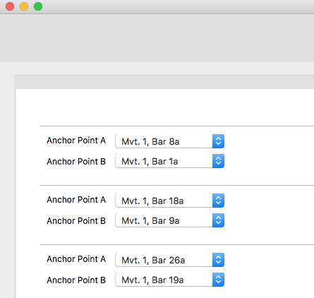
What now remains to be done is to link these two anchors. That’s done by another part of the development tool:
We also had to solve another problem: Once the end of a trio has been reached in a minuet, the beginning of the repeat is not clear. Should the second part of the trio be repeated or has that already happened and it’s time to go back to the beginning of the minuet? We came up with a pragmatic solution: The musical text of the minuet is repeated after the trio. Thus you no longer have to go back and there is no ambiguity at the end of the trio.
Comments on the musical text – bringing together what belongs together
You’ll also be familiar with this: When you’re playing through the music, you stumble over something or find a passage that you don’t quite “get”. Is it really meant like this? You want to learn more about how this part of the music came about. After the music at the end of our printed editions, you’ll find the Comments. So you turn to them, find the appropriate place and measure in the Individual comments and then with a little bit of luck you’ll find an explanation of the passage that threw you. If you remembered to do so, you left a finger marking the appropriate page of music so that you can flip back and forth between the music and the explanation (where was it on the page again?) and finally get to the bottom of things.
Let’s now switch to the digital version. There’s a magic solution for situations like this, it’s called: “hypertext”. This means that additional information can be reached and represented in any place in a text (even in a musical text), using a so-called “hyperlink” (a programmable link). So it makes sense to be able to access a comment at the place where it’s needed in the musical text.
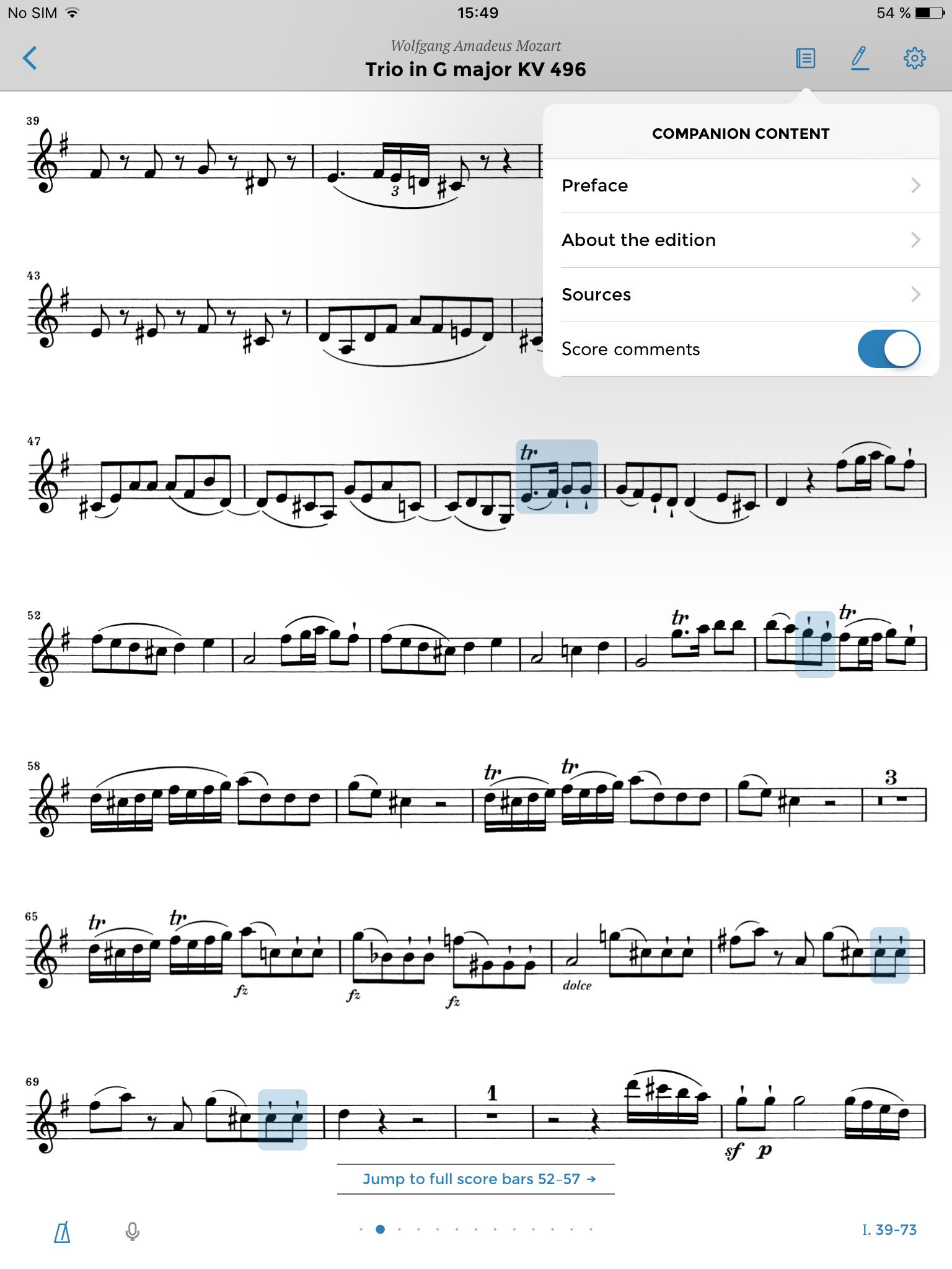
In the app you can do so by turning the comments on or off. Here you can see the musical text with the comments turned on:
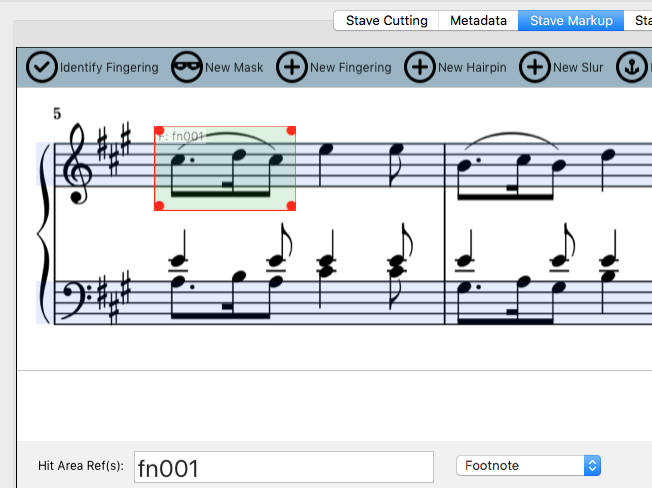
Of course, these highlighted areas have to be programmed “into” the musical text. Let’s have a look at how this is done in Scoreproducer:
First of all we have to place a box over the passage that will later become a comment area in the app. We then also have to assign it a unique identifier so that it is clear which comment refers to it. In addition we also have to specify whether it is a footnote to the musical text or an individual comment from the Comments section at the back of the printed edition.
But how do we now get the text for this comment (and likewise the other non-music texts such as preface, sources, etc.) into the app? All of the “texts in words” for our printed editions are on hand in desktop publishing programmes such as Indesign or Framemaker. Although these data sets can provide the texts for the app, it is not possible to re-use the layout for the most part. For instance whilst a page layout with three columns makes sense in print, it is not practicable for the iPad, indeed it is simply not possible for visual and technical reasons.
So the first step when we transform a word text into a digital one is to turn our printed data set into a neutral set. We use XML (eXtensible Markup Language) to do this as it has pretty much become the standard.
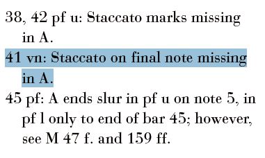
So what looked like this in the printed edition,
looks like this once it has successfully been transformed using an XML editor:
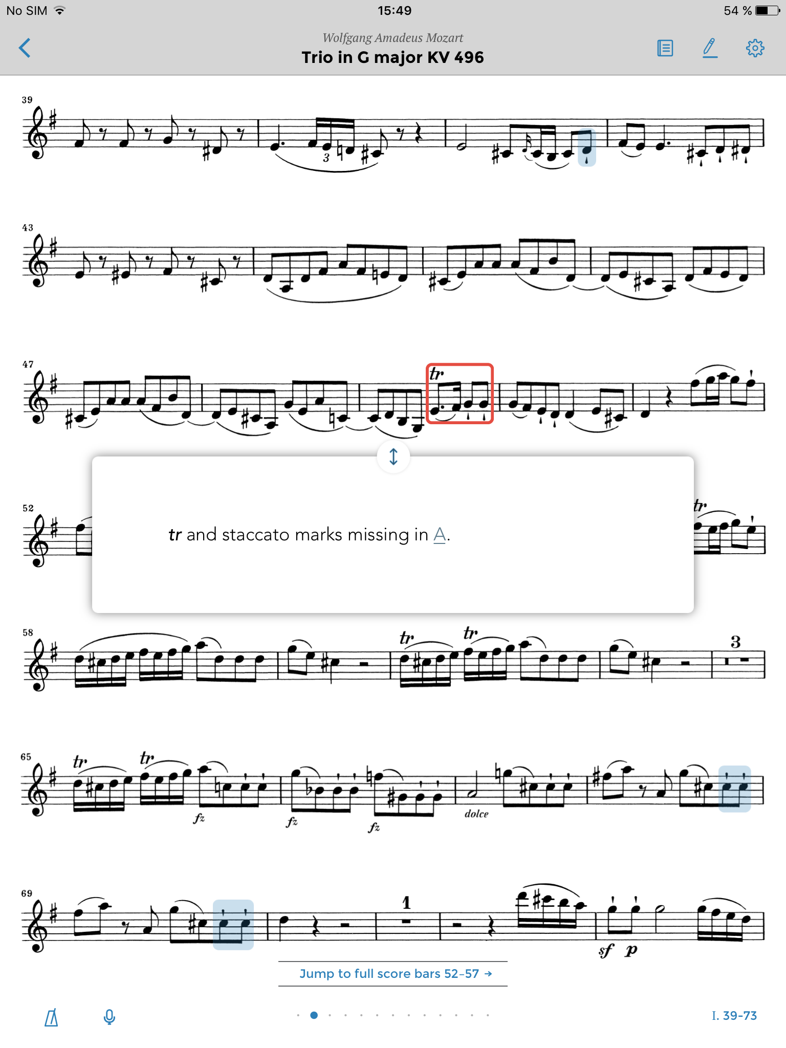
In the app, this text then finally appears in its own pop-up window when you tap on the comment area in the musical text.
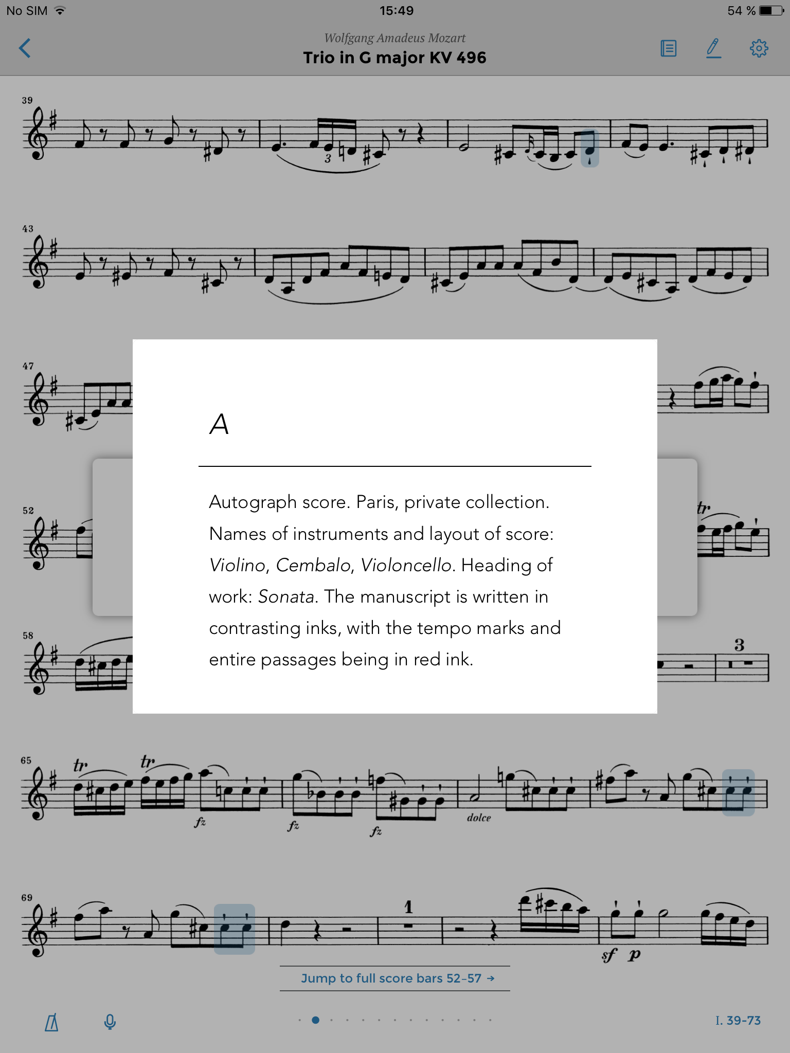
The source abbreviations – in this case “A” – are then linked to the appropriate source information that is somewhere else. A hyperlink – activated by tapping on the link– makes another window appear in which the source abbreviation is explained:
This technology enables us to deliver all kinds of information on the musical text. We’ve used the comment field function, for example, to offer direct translations of unusual performance instructions at the appropriate place in the musical text. In our printed editions they are explained in a list at the back of the edition, following the comments.
I think this is another great example of how the digital medium is offering us new ways of making it easier for musicians to work with the musical text. It is this, along with many other aspects, which makes the Henle Library App stand out.
DOWNLOAD THE APP
![]() Download the app from the App Store to your iPad:
Download the app from the App Store to your iPad:
Available for Android Tablets in June 2016!
Find useful hints on how to use the app here.

