In February 2016, over three years ago, we launched the iOS version of our Henle Library app. A great deal has happened since then, not only as a result of what we ourselves have done but also due to Apple and the iPad itself. So, it’s time we gave you a little update about what has been going on!
You’ve probably already noticed that a growing number of musicians, even in the world of classical music, are now using tablet computers when performing. When I look back over the past few weeks and months, I can think of any number of times that I’ve seen (mainly) iPads being used in the concert hall or in rehearsals – a recital with Leonidas Kavakos and Yuja Wang, at which she performed with an iPad on the piano and an additional pedal underneath it; a concert with Julia Fischer and Augustin Hadelich with the Academy of St. Martin in the Fields where one of the cellists in the orchestra was using a tablet and not printed music; and finally at home at a rehearsal with my piano trio, where the cellist now arrives with his cello and large iPad – he became an instant convert after he had heard about the app.
In addition, one of the librarians at the renowned Juilliard School in New York, who is extremely keen for us to find a way for the app to be used at the conservatory, has informed me that a considerable number of students there are now only “out and about digitally”. We can no longer close our eyes to the fact that the digital revolution, which is happening all around us, is also changing our daily musical life. And the extent to which this digital transformation continues to spread remains an exciting and challenging question for us over the coming years and decades.
I keep emphasising, particularly to colleagues in the world of print, that unlike with a book project that has a clear end – upon its publication – when our Henle Library app was launched, that was just the beginning. First of all, we had to prepare the Urtext editions in our catalogue for the app. There are now around 500 Urtext editions available (meaning around 6,000 individual items because we offer all works and all of the parts for chamber music for individual purchase).
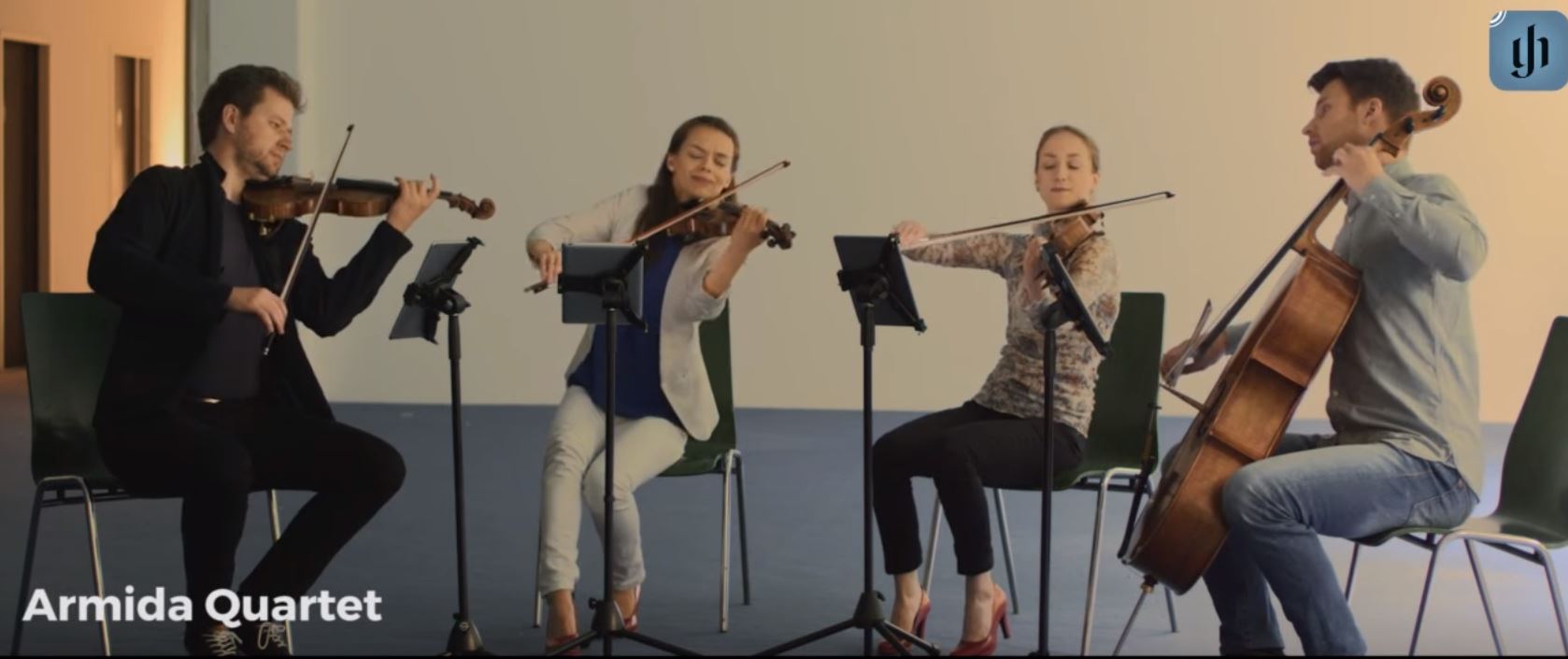
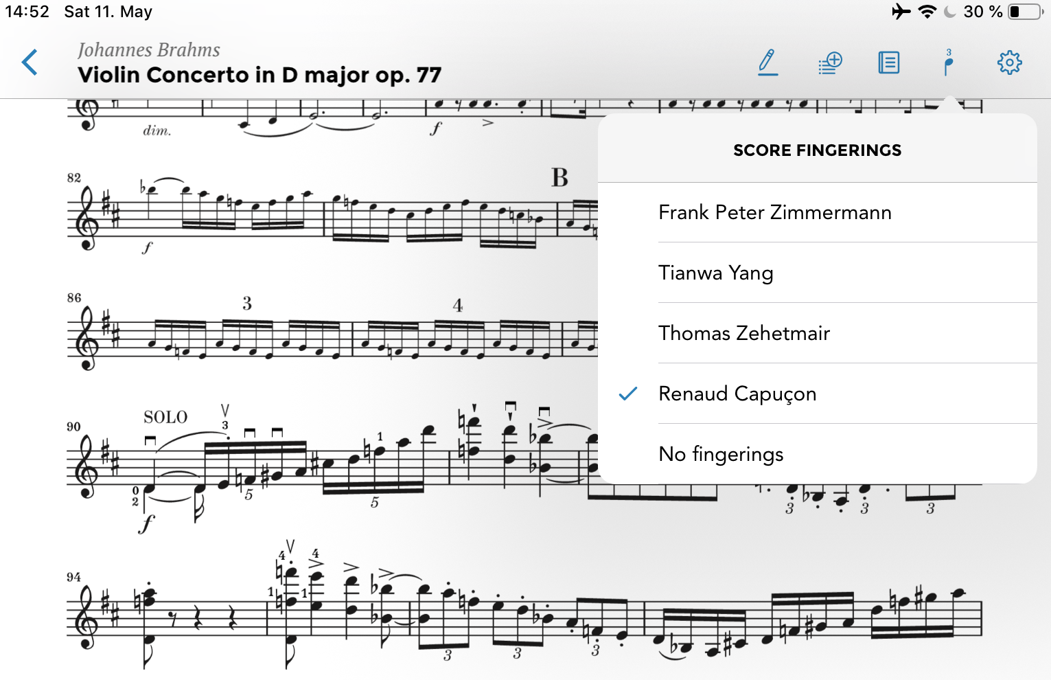
And in addition to this, we would also like to continue expanding our special “feature”: the opportunity to view bowings and fingerings by distinguished artists both past and present for key solo and chamber music works. We are extremely proud and grateful that such a great number of first-class instrumentalists have added contributions exclusively for our app: Renaud Capuçon, David Geringas, Johannes Moser, Antoine Tamestit, Christian Tetzlaff, the Armida Quartet, to name but a few.
Aside from what we have been adding to our app, time and again we have been faced with new challenges as a result of developments and improvements by Apple. The large iPads with a 12.9“ screen have been of enormous significance for musicians. The first one appeared in November 2015, at a time when we had almost finished developing our app, with the smaller model in mind. Admittedly, we had made it possible for the music to be adjusted to fit the size and ratio of the screen but we could not, however, have foreseen that the larger screen size of 12.9“ would allow two pages to be displayed side by side in landscape format – and what’s more in a size that is easy-to-read! This is something we will address in a future update of our app.
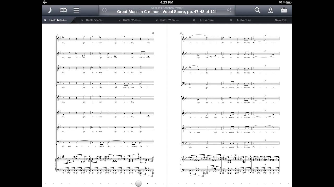
Two-page view in ForScore
Apple also introduced the Apple Pencil stylus with the iPad Pro, and now we even have the Pencil 2 with its own Action Button on the stylus itself. We decided to make the most of this opportunity to change our whole annotation mode in a recent update, as it was not optimized for use with the Pencil. At the same time, we also undertook a number of other changes and additional improvements. But one thing after another.
- You can now enter the annotation mode in three different ways. If you have a Pencil (1), just tap on wherever you want in the music and the app automatically switches to annotation mode. With the Pencil 2 you can also double tap on the side of the stylus to change to annotation mode. (Of course, you can still also do so using your finger. Just tap and hold on the music until it switches to annotation.)
- One of the criticisms of our old annotation mode concerned the large number of boxes that appeared around everything that was written. These boxes are now history when writing and deleting entries. They only appear if you want to move them to another place in the music using the new move icon.
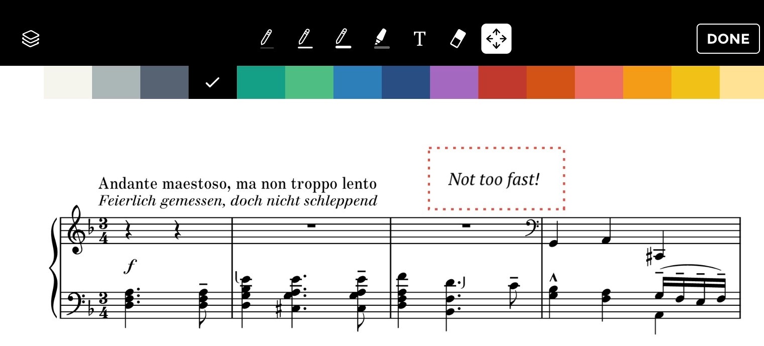
- We now finally have a delete function. Just select the icon in question and tap on the entry that you want to delete with your finger or the Pencil.
- Whereas in the past you were only able to make entries in one stave, this has now been changed. In annotation mode you can now switch between the staves at will.
- When you are in annotation mode, you can navigate around the score by swiping with two fingers. You can now also enlarge or reduce the size of the music by using the pinch to zoom motion.
- And last but not least we have also added several useful symbols to the symbol palette.
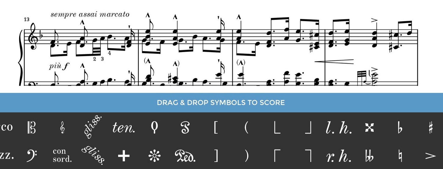
Aside from these changes to the annotation mode, we have made another substantial alteration that will, in all probability, be barely noticeable at first sight: We have made more screen space available for the presentation of the score.
We hope that you will enjoy using the Henle Library app even more when playing music following these improvements. Please do let us know what you think we can improve in the future and do not hesitate to contact our support if something does not work in quite the way that you would like: app-user-support@henle.de.
And many, many thanks to everyone for all of the enthusiastic feedback on our app!

Thank you for your continued development, please implement half page turns soon! Without half turns, I can’t use the Henle app for playing or performing. It is possible to print Henle parts to PDF and then import the PDF into ForScore, which supports half page turns. But I would prefer to stay within the Henle library app.
Dear Mr. Boyer,
Half-page turns are on the list of future improvements, we will hopefully get to solving this in one of our next updates.
Best wishes
Norbert Gertsch
One of the main problems with the app at this point is the very large margins when in printed layout on the iPad 12.9. This makes the score very small. I prefer to use the printed layout rather than the custom layout.
Please create an option to allow adjustment of the margins in the printed layout. Most other sheet music apps (forscore, etc) have this.
Dear Mr. Smith,
Thank you for this reminder! We have already improved the margin issue in one of our recent updates. The “problem” is that the app currently chooses the biggest page and makes this fit to the screen. All other pages will be showed in the same proportion, which sometimes then is much less music and much more margin on these pages. To make this work even better, we would have to calculate each page separately, which then has the odd side effect that the music would be blown up in some cases and smaller in others. That’s also not really satisfying. But we will see if we can come up with something more sophisticated in future.
All best wishes
Norbert Gertsch
I love this app, and love Henle editions integration! With each update, it just gets better and better!
There’s one small feature that I’d welcome, though. I use the app with a Bluetooth pedal, and sometimes it’s not completely obvious that a page turn has actually occurred. Would it be possible to implement some very subtle (optional) but rapid animation: page image shift for example? That would help me immensely! Thanks so much for this wonderful app!
Dear Mr Wachowicz,
Thank you for your kind words! I am glad to hear that you enjoy using our app. This is an interesting aspect. We have always tried to make the page turns as “invisible” as possible, but maybe that can be irritating in the sense you describe. I will ask around for more opinions on this. If it is something more users are interested in, we will consider including it in an update.
Best wishes
Norbert Gertsch
Thank you for the great app! Could you implement the ability to change the font size for fingerings and Bowings? Some of the fingerings I mark on the score is so small that it is barely legible. Thank you!
Thank you for your kind words. Your request is unfortunately very difficult to implement. But we will add it to the list of possible improvements for the future.
Norbert Gertsch
Please keep the page turn as it is – the invisible fast page turn was reason for my going digital using your app and buying a pedal.
Without that I’d remain with printed music.
If you do introduce something please ensure it is optional.
Dear Eric (if I may),
The app offers a setting where you get the exact page layout as in the printed edition. The only cases where we change something is by adding the repeat of a Menuetto after a Trio for example so you don’t have to turn back. Could you let us know where you find a different layout than you would like to see?
Best wishes
Norbert
Is it possible to add a score-delete function, so that I can delete or hide unwanted scores?
Also, for annotations — a way to vary the size of text, and perhaps a little up-down-right-left arrow tool that will move each letter or symbol precisely?
Thank you, Robert, for your suggestions. We will add them to our list of possible improvements.
Norbert Gertsch