 If you quickly want to describe a Henle edition, one sentence is enough: it is the pigeon-blue music score, showing on the cover merely composer and title without any ornamentation. For where other publishing houses employ a large graphics department and select the most diverse fonts, designs and illustrations for different composers, eras or scorings, or at least vary the colour of the card stock cover, holding sway at Henle are the strict rules of B&B: blue cover stock and Bodoni font. Can a blog post be written about something like that? Of course! For first of all, knowing where this minimalist design originated is of interest, and then we editors can tell you a thing or two about how difficult it sometimes really is, to say everything in the few lines stipulated by our strict layout – or at least enough to make the content instantly recognisable.
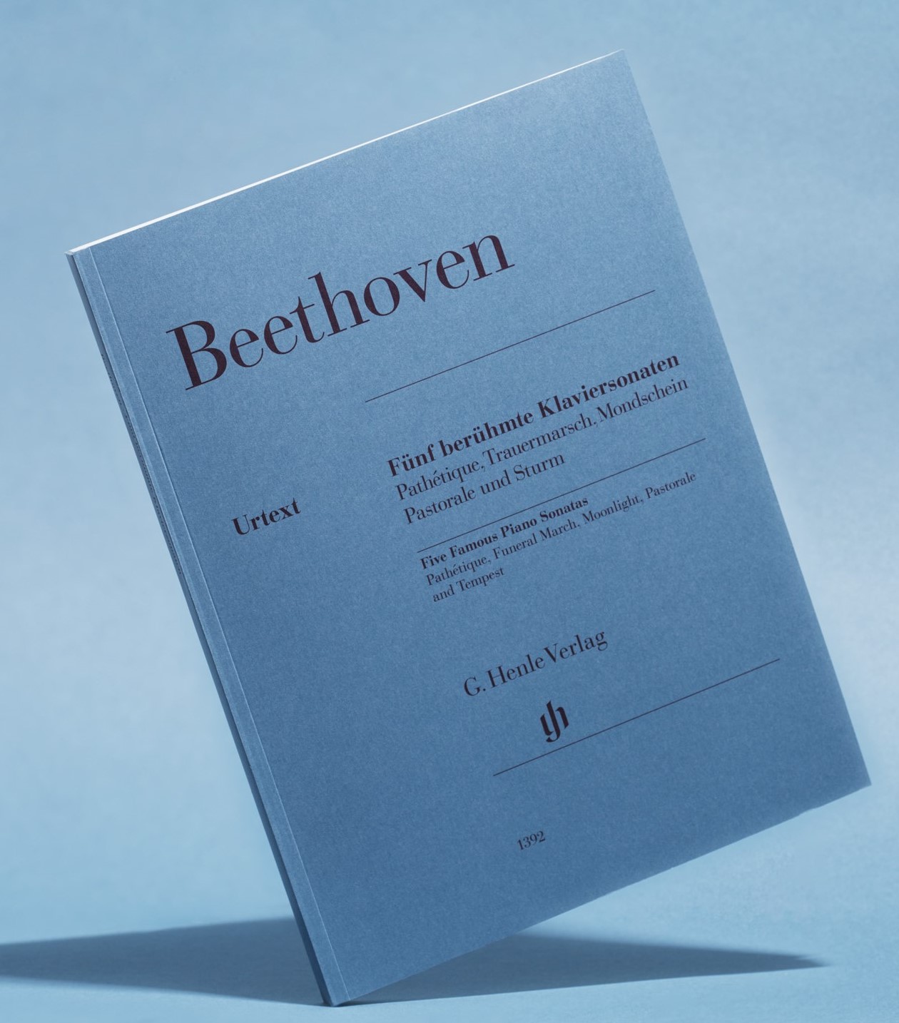
The volume of Beethoven’s Five Famous Piano Sonatas (HN 1392, photo © Robert Brembeck/G. Henle Verlag) illustrated above, where besides the volume title are also five separate titles in two languages, impressively demonstrates already how cramped the situation can get. The only thing helping here is to have the ‘courage to leave blank’ – as revealed by a glance at the individual covers of the five sonatas’ separate editions, each of them showing a much more detailed text. It is, of course, no coincidence that chosen for the omnibus volume were (just!) the popular titles, rather than the opus or sonata numbers. This is the only way to identify the five sonatas straightaway, even for non-specialists. Yet, a small concession had to be made: ‘Grande Sonate pathétique’ for Opus 13 became simply ‘Pathétique’ on the anthology cover. Omitted, furthermore, was the usual differentiation between such an authentic epithet and later popular titles such as ‘Moonlight’ or ‘Tempest’ that only appear in brackets on the cover. A small but rather important difference for an Urtext edition…. (And even so, we had to cheat a little, for the English title is actually allowed only two instead of three lines in the layout).
But why do we have to have such a tight straightjacket of 3 + 2 lines for the title, and that’s that? To find out, you’d have to delve a little into the publishing-house history: Günter Henle associated his idea of the Urtext music edition with an absolute reduction to the essentials, free of ‘modish’ additions and any ornamentation – applicable not only to the music, but also to the presentation. Consequently, of the various design drafts submitted in 1947 for Mozart’s piano sonatas as the publishing-house’s first title, the simplest won out. Joseph Lehnacker’s cover stated as succinctly as possible the composer’s name, the music work and the publishing house, placing at the centre what was most important: the quality symbol ‘URTEXT’. Combined with the subdued pigeon-blue cover colour, this exuded an aura of classicism corresponding to the works’ canonical status.
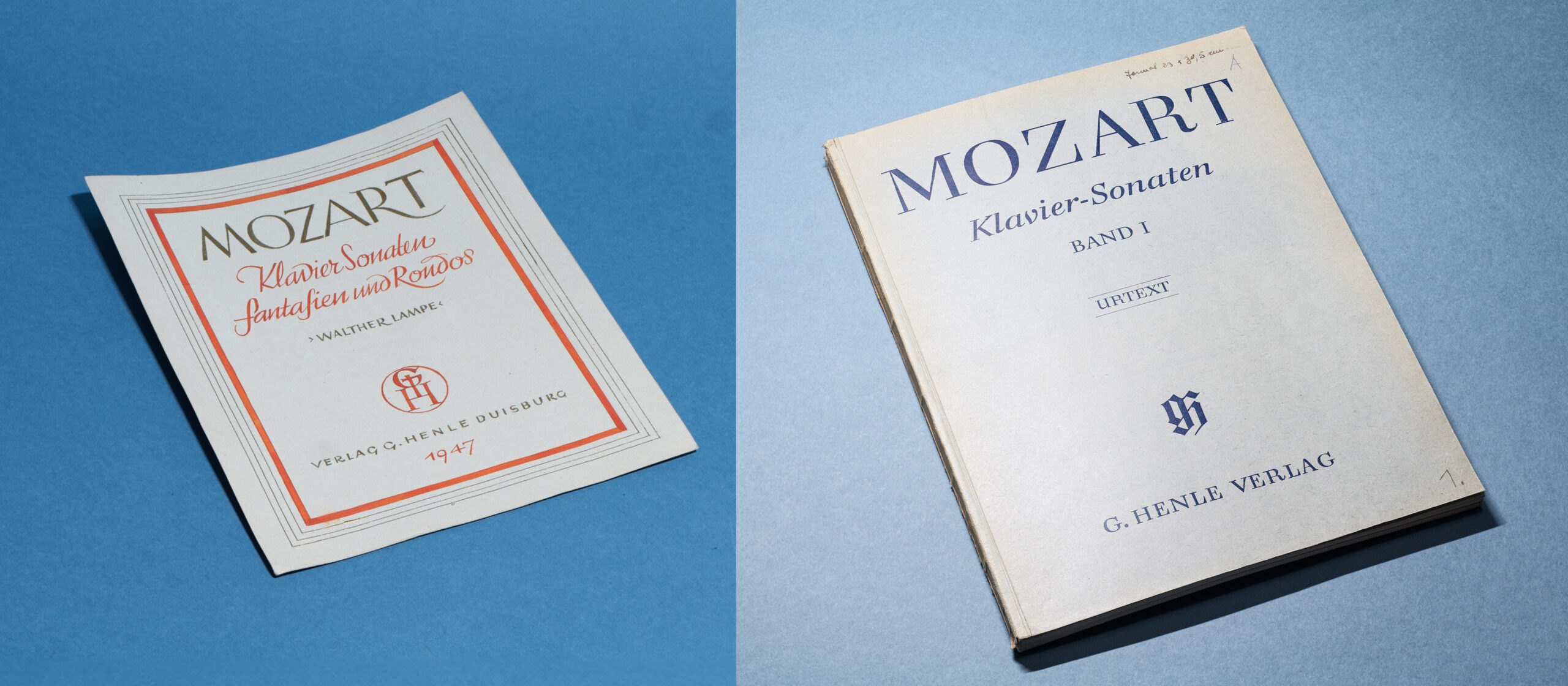
left: early unrealised cover draft; right: first Henle edition (Photo © Robert Brembeck/G. Henle Verlag)
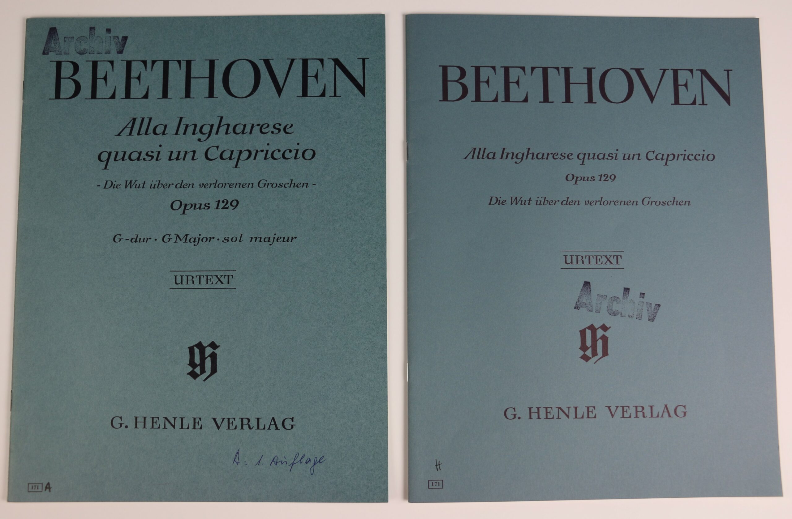
For over half a century this appearance remained the same, apart from discreet adjustments to font size, such as that experienced between 1965 and 1997 by Beethoven’s Capriccio op. 129, ‘Die Wut über den verlorenen Groschen’ / ‘The Rage over the Lost Penny’.
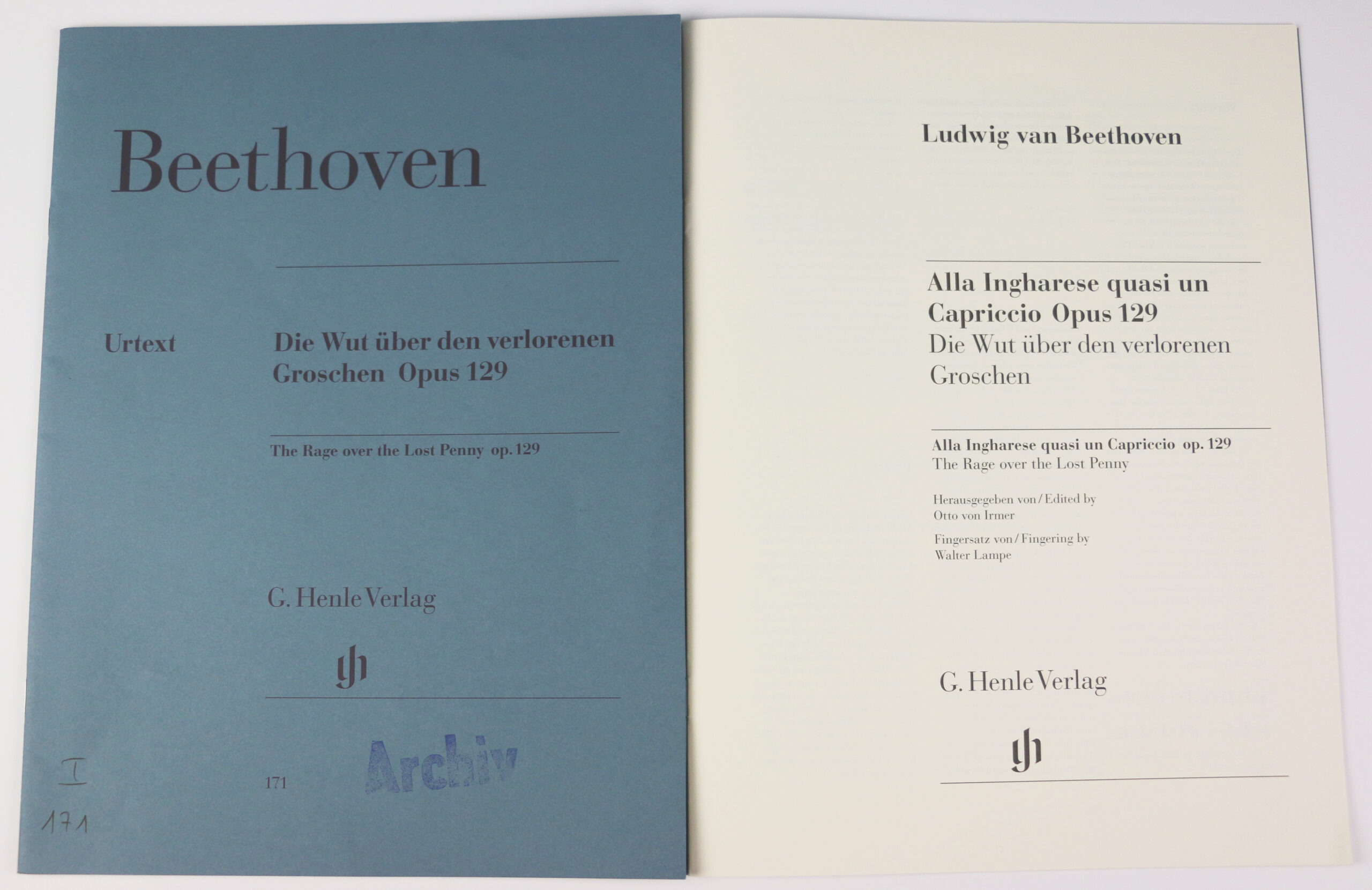
It was not until 2000 that the time became ripe for a change – not least because the publishing house’s increasingly international focus also required an English translation on the cover. Introduced in the process was a more modern version of Bodoni, also three horizontal hairlines (just a hint of decoration!), and the title field was cleverly shifted so that the publishing-house information, including the newly designed logo centred beneath, appears flush. What worked without any problems with Mozart’s Piano Sonatas, Schubert’s Moments Musicaux (as an untranslatable original title) and even Haydn’s Violin Concertos (with the cumbersome Hoboken numbers) proved, however, to be a challenge with somewhat more unusual titles, as the further fate of Beethoven’s opus 129 shows: The full title had space only on the inside title page, where the slightly modified cover layout thankfully permitted a fourth line of text.
Lack of space on the outside cover, however, required making do with merely the popular title. When the edition was revised in 2022 (HN1632), the cover was also again scrutinised and brought up to ‘current standards’: at least the genre indication ‘Capriccio’ was slipped from the original title to the outside cover and the popular title, not attributed to Beethoven, was placed in brackets – that much Urtext is a must.
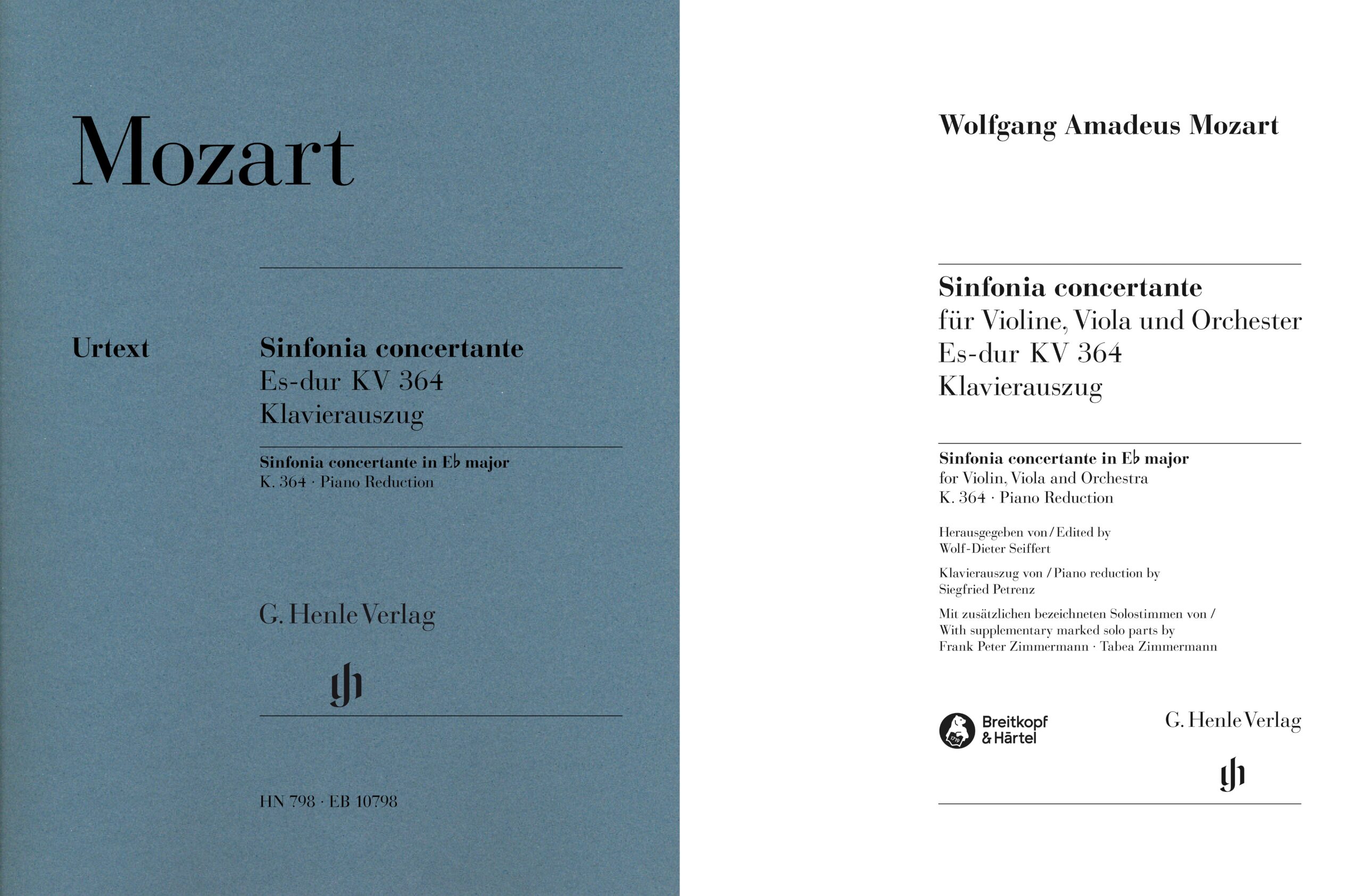
It can also get a bit cramped between the horizontal hairlines for lengthy genre terms such as Mozart’s Sinfonia Concertante (HN 798): Naming the solo instruments would only have fitted in here by omitting the line with the K number or the indication ‘Klavierauszug / piano reduction’. The former is an absolute no-go with Mozart, the latter a problem for customers, who will then not know whether they are dealing with an (orchestral) score or a piano reduction…. So here too, the fourth line on the inside title saved the details.
But sometimes even the fourth line doesn’t help, and then long discussions begin – as my colleague Dominik Rahmer can report concerning a title currently in preparation:
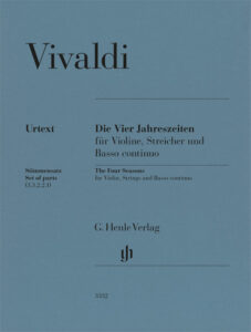
We have tried out over half a dozen cover versions of Vivaldi’s famous cycle The Four Seasons. Technically speaking, these are four independent violin concertos, so according to the Henle standard, the title should actually be ‘Violin Concertos RV 269, 315, 293, 297’. Though, of course, no customer would ever recognise this on the shelf or find it in the catalogue.
To complicate matters further,
Vivaldi’s four concertos were not published under the title ‘Le quattro stagioni’, but as part of a larger collection of 12 violin concertos called Il Cimento dell’armonia e dell’inventione Opus 8. Although the first four concertos in it are titled according to the four seasons – La primavera, L’estate, L’autunno, L’inverno – the collective title Le quattro stagioni never appears expressly in the original sources.
If we’d want to put all this information on the cover, plus the exact scoring details, we’d end up with a title wording of baroque proportions…. So, in the end we decided to put just the now generally-known, common title on our cover – and leave the details of the original titles to the Preface and Comments.
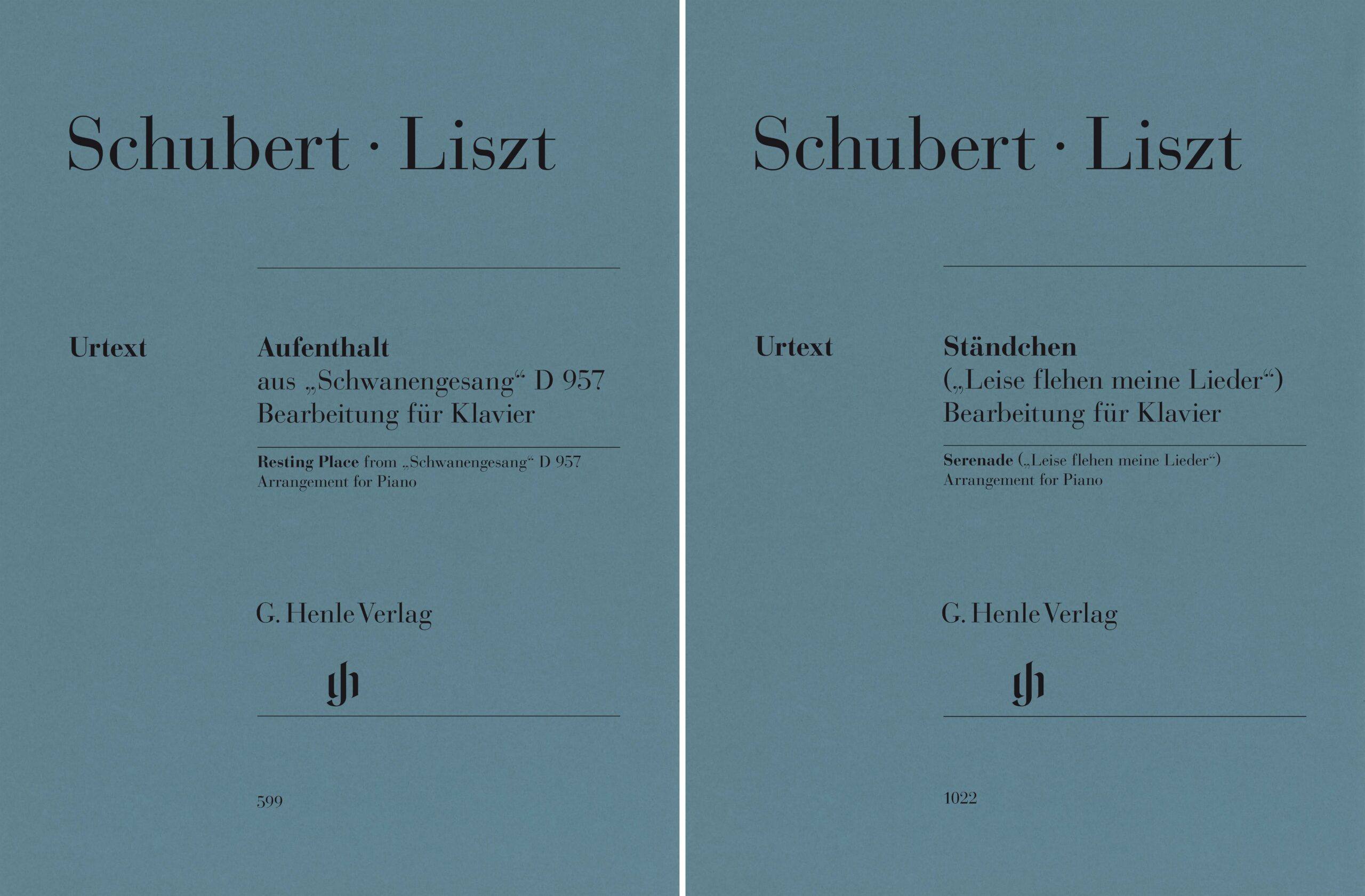
Needing quick and clear identification is also the reason for a seemingly-odd difference in two recently published lied arrangements by Franz Liszt: for Aufenthalt (HN 599) from Schubert’s Schwanengesang D 957, we were able to realise the classical concept without any problems by referring to the original cycle. Since, though, for the arrangement of Ständchen (HN 1022) from this cycle, we had to make sure that it would not be confused with the arrangement of the other (almost equally famous) Ständchen D 889 – the lied’s verbal text incipit appears on the cover.
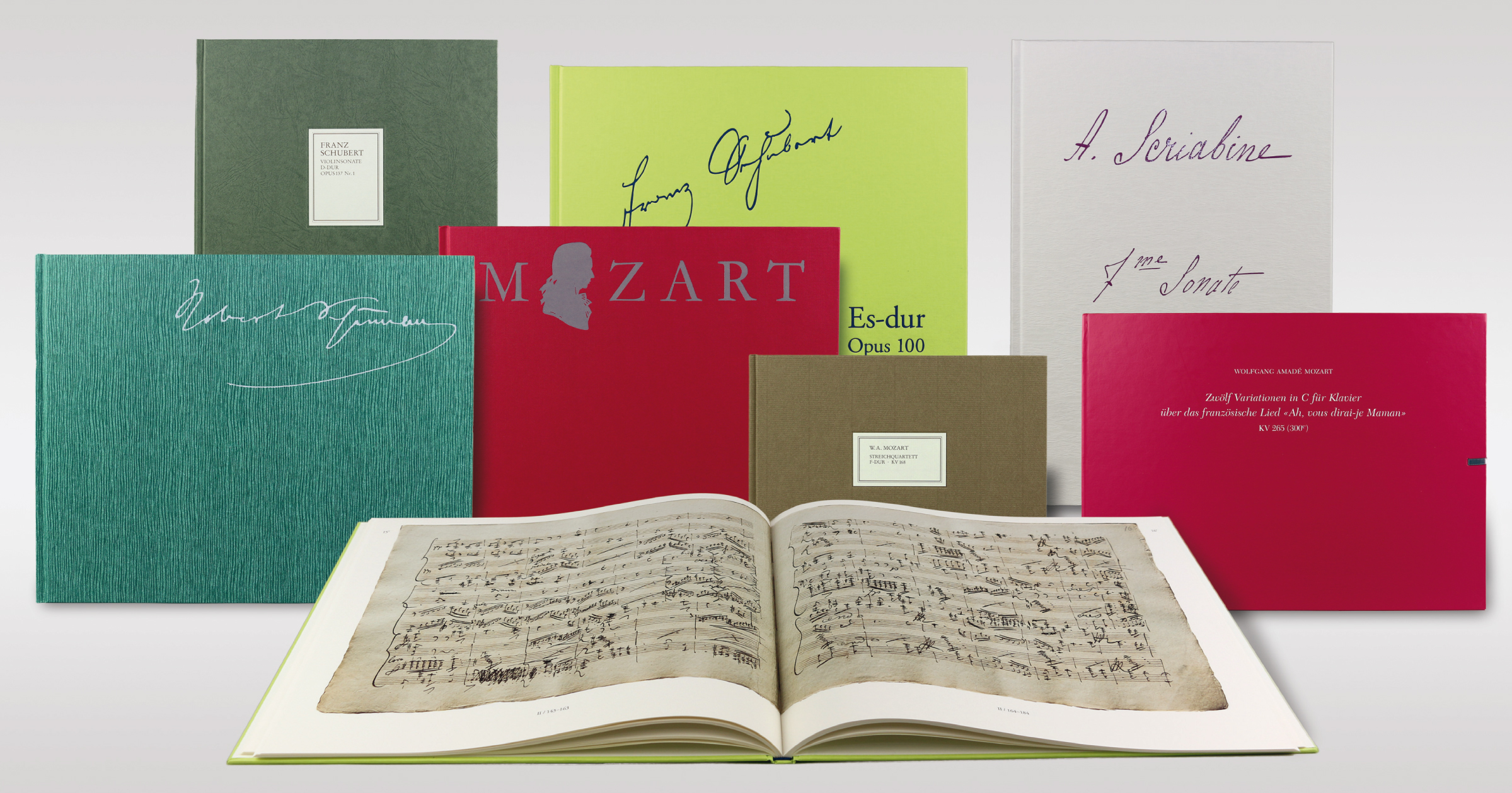
Günter Henle’s idea of a strict and consistent title layout is still a challenge for us editors today. But, of course, the Henle publishing house also allows itself from time to time a little excursion into the realm of colour and decoration: in the series At the Piano, a second colour on the cover signals the editions’ special concept, aimed at those returning to the piano – and if we want to be truly colourful, then we make a facsimile. Everything from apple green to pacific blue is allowed!


